Freshening up the Bountiful Baskets website user experience
Quick Info
- Project: Bountiful Baskets Site Redesign
- Timeline: November 2020 to December 2020
Resources
- UX Foundations: Research (Lynda.com course)
- Figma for UX Design (Lynda.com course)
- The User Experience Team of One by Leah Buley
- The Non-Designer's Design Book by Robin Williams
Overview
Bountiful Baskets is a volunteer-run produce collective; individuals pool their money and buy produce in large quantities from resellers at deep discounts, and then the produce is split evenly between the group. I’ve been using it since college and it has changed the way I cook (and helped me make sure I get enough servings of fruits and veggies every day for on a budget).
NOTE: I am not affiliated with the Bountiful Baskets organization in any way. This redesign was a personal exercise I undertook entirely on my own time.
The organization has truly changed my life, but the website leaves something to be desired. The information architecture is confusing and the design is outdated. In an effort to expand my UX/UI skill set, I decided to create a proposed redesign of the site. My process began with usability testing and a heuristic review of the current site; I then created a design brief, sketchboard, task flow, and wireframes for a proposed redesign.
Objectives
Primarily, I wanted to learn more about user experience and user interface research and design principles. I also wanted to pinpoint some specific “pain points” in the current Bountiful Baskets site and create a research-based, simple proposed redesign to solve those pain points.
Challenges
The primary challenge I faced with this project was intimidation. I knew I wanted to complete a comprehensive case study, including research and light design elements. However, at first I was at a loss of how to start. I overcame this challenge with lots of research. I utilized books, articles, other UX/UI portfolios, and Lynda.com courses to fill the gaps in my knowledge. I spoke to a few UX/UI professionals and solicited feedback on my progress any chance I could.
I completed this project in the winter of 2020, which meant I was self-isolating due to the COVID-19 pandemic. Because of this, I had to conduct all the initial user research and interviews almost completely remotely. That felt awkward at first, but utilizing the tools of Zoom (especially the screenshare feature) helped to make the tests feel more natural and personal.
Research
Usability Tests and Interviews
- Young single who is budget-conscious
- Young mother who prizes convenience
- Middle-aged professional who loves to cook
- Middle-aged professional who follows a plant-based diet
- Middle-aged tech-savvy professional
As a long-time user of the Bountiful Basket site, I am familiar with the paths I need to follow to get the desired outcomes. I wanted to conduct some research that would specifically target first-time users to see it through fresh eyes. To do this, I conducted usability tests of the current site with five different potential users, none of whom had used the site before.
The usability test typically lasted fifteen to twenty minutes; after the participants completed five tasks, I asked them for general feedback about the site. All but one of the tests were conducted remotely (through Zoom), which presented some technological challenges initially, but once we were able to start the screenshare, things went well.
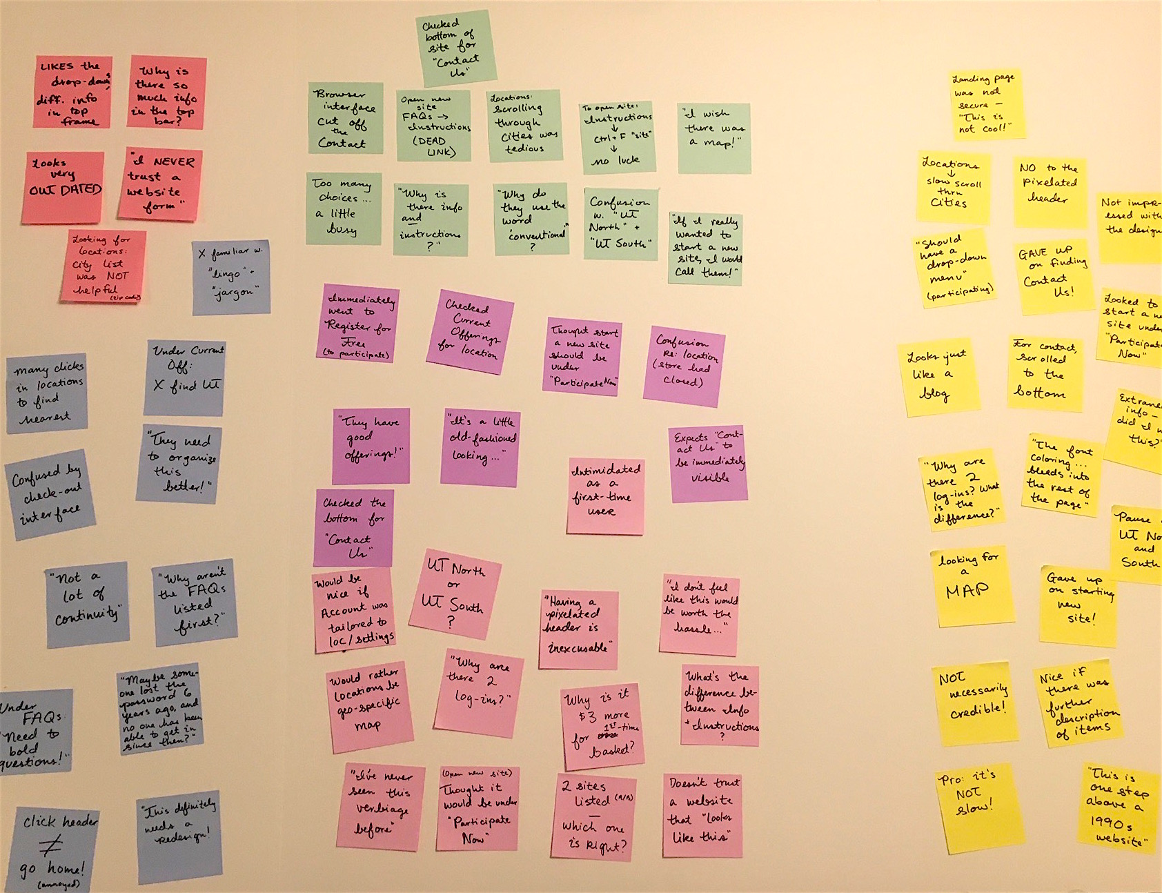
Through the usability tests, a few key insights that jumped out:
- The site relied on jargon-y phrases early in the site experience that beginner users found intimidating or confusing.
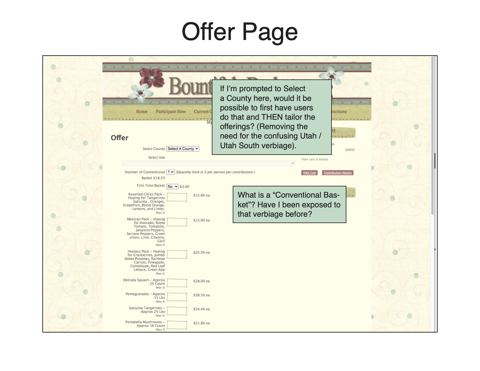
“I’ve never seen this verbiage before.”
“Why do they use the word ‘conventional’?” - The “Nearest Pick-up” feature was counterintuitive; four of the five users tested expressed frustration and wished for a map.
“I wish there was a map!”
“The city list was NOT helpful.” - Generally, the site seemed to contain too much information, and the information architecture was confusing and clunky.
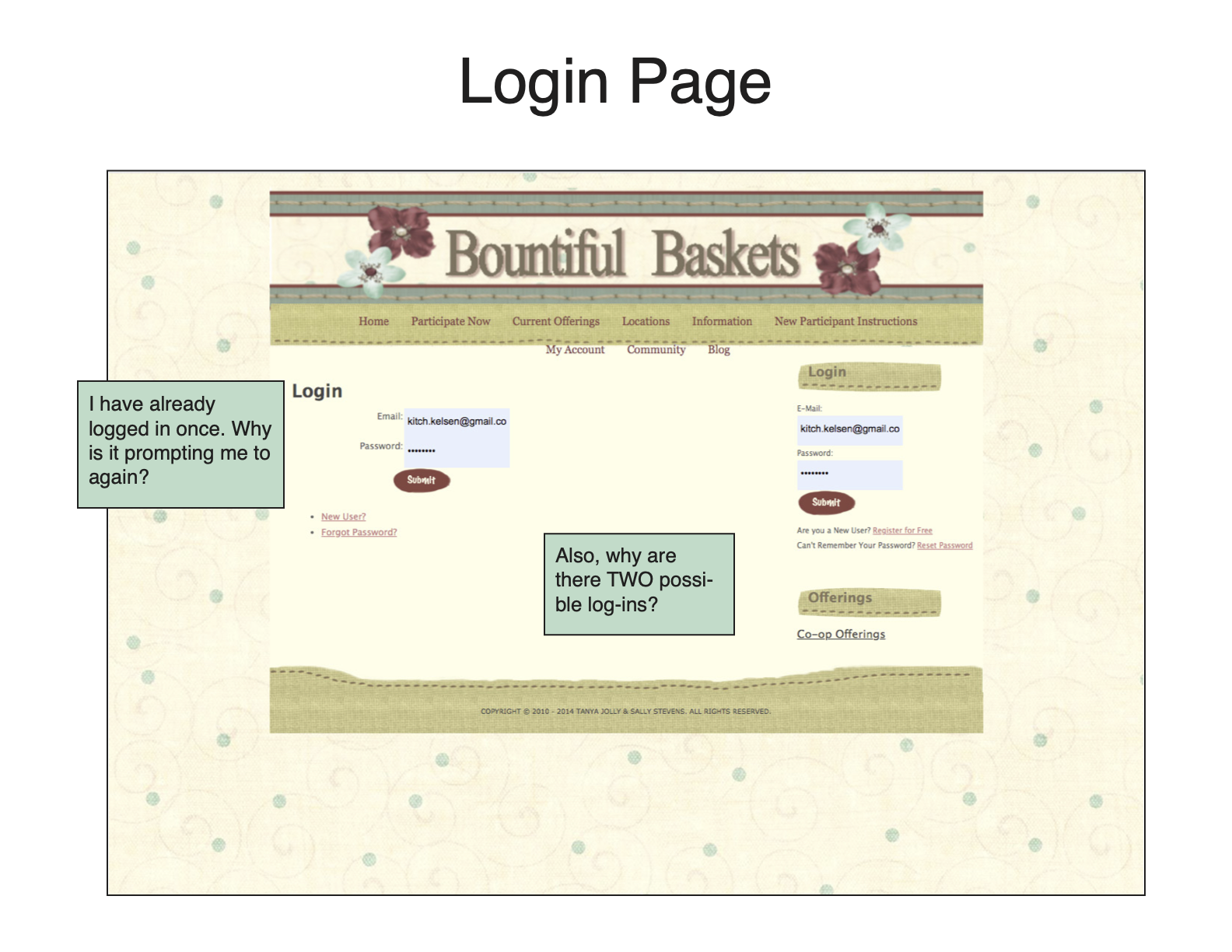
“Why are there two log-ins?”
“Why is there so much information in the top bar?” - Finally, the design of the site immediately hurt its credibility among first time users.
“It’s a little old-fashioned looking…”
“This is one step above a 1990s website.”
“Maybe someone lost the password six years ago and no one has been able to get in since then?”
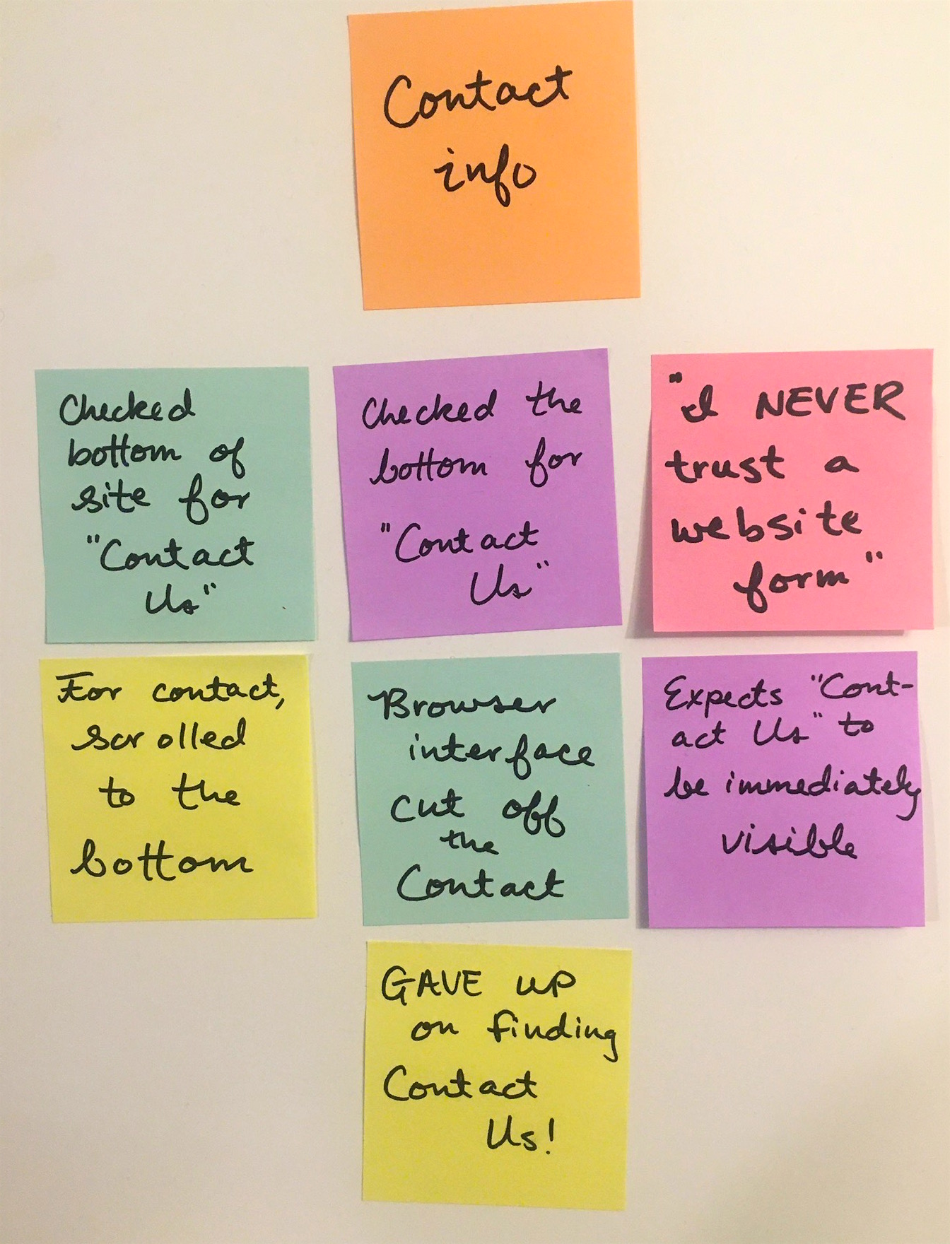
After the usability tests, I recorded key insights from each participant on sticky notes and organized them into an affinity map.
The affinity map helped me visualize what was working and what wasn’t. For example, most users had one or two points of criticism regarding the “Nearest Pick-up” feature; only one person had any trouble with the “Current Offerings” feature.

Heuristic Markup
After gathering this feedback from different users, I had a lot of ideas. I wanted to focus some of my feedback, especially regarding the ordering process, so I decided to try Leah Buley’s method for completing a heuristic markup. A heuristic markup differs from a heuristic evaluation in that it “places less emphasis on recognized standards and more emphasis on your own gut reactions and responses as you move through the product” (Buley 136).
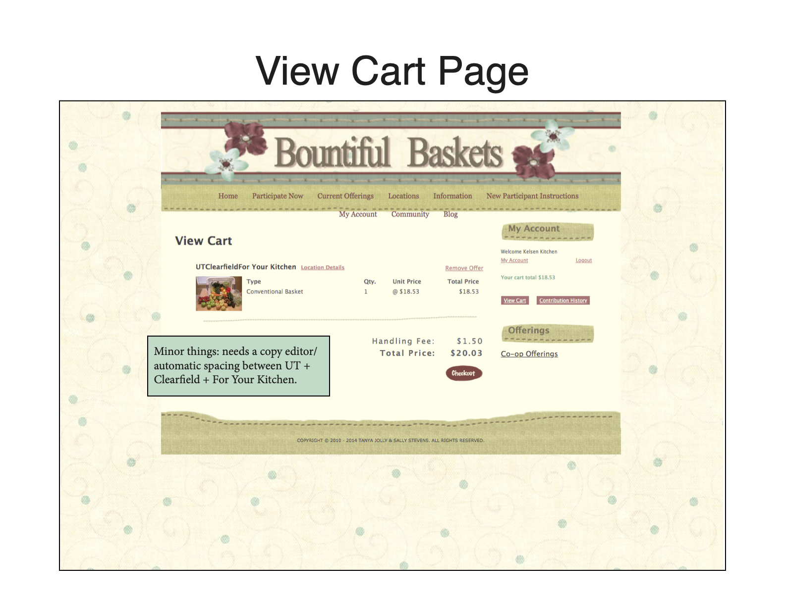
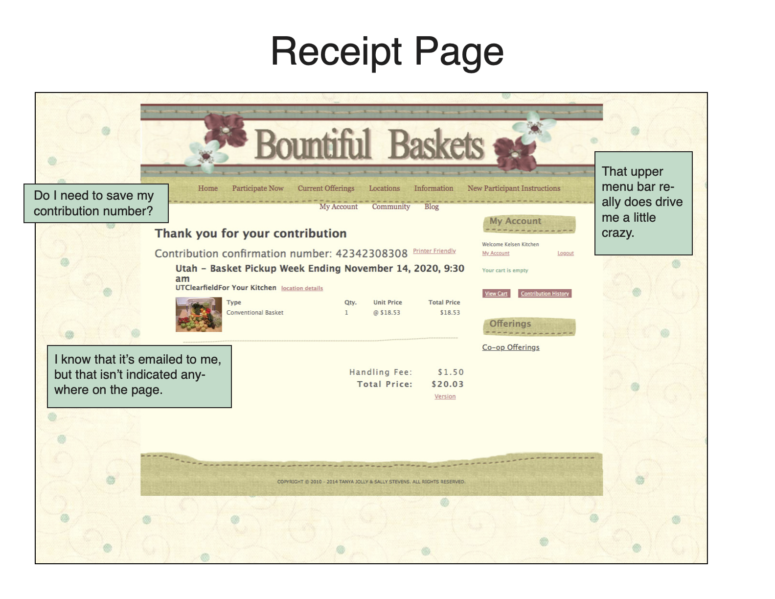
The basket ordering process consists of ten different pages, from beginning to end. In my markup, I tried to step out of the shoes of an “experienced user” and see the pages from a different perspective, especially now that I’d gathered feedback from first-time users.
A few things I noted from the heuristic markup:
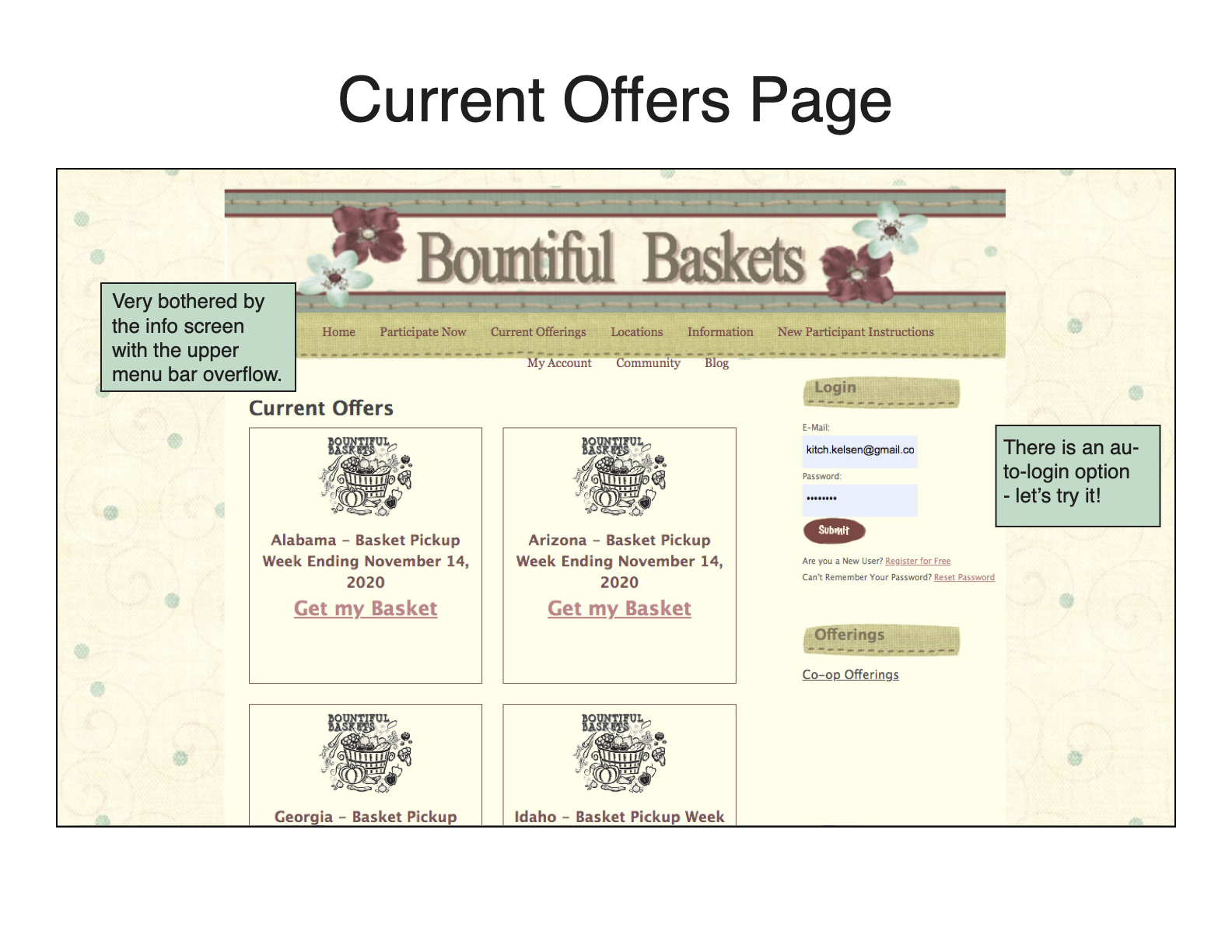
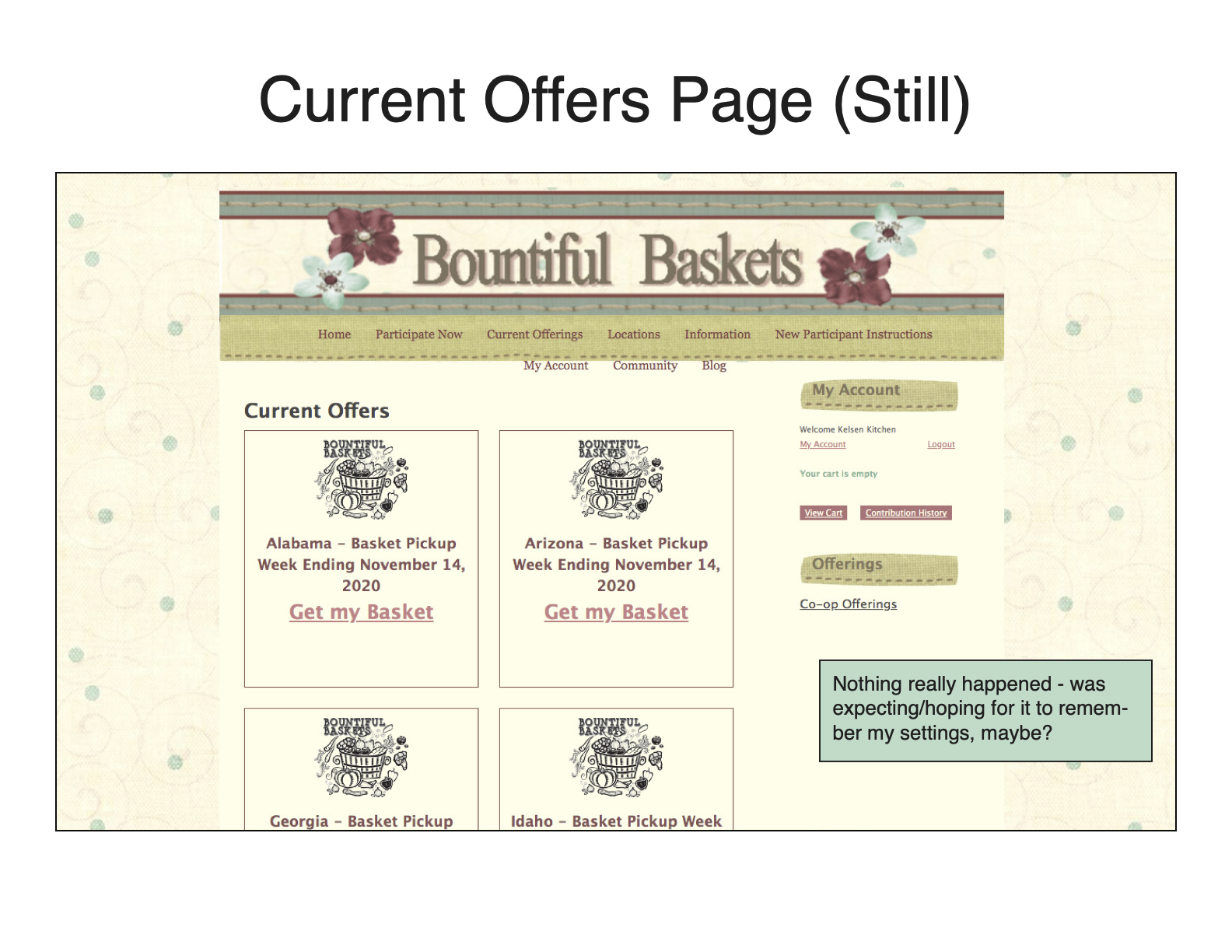
- There is a redundant log-in prompt; I logged in early in the process, and was almost immediately prompted to log in again once I’d selected my location.
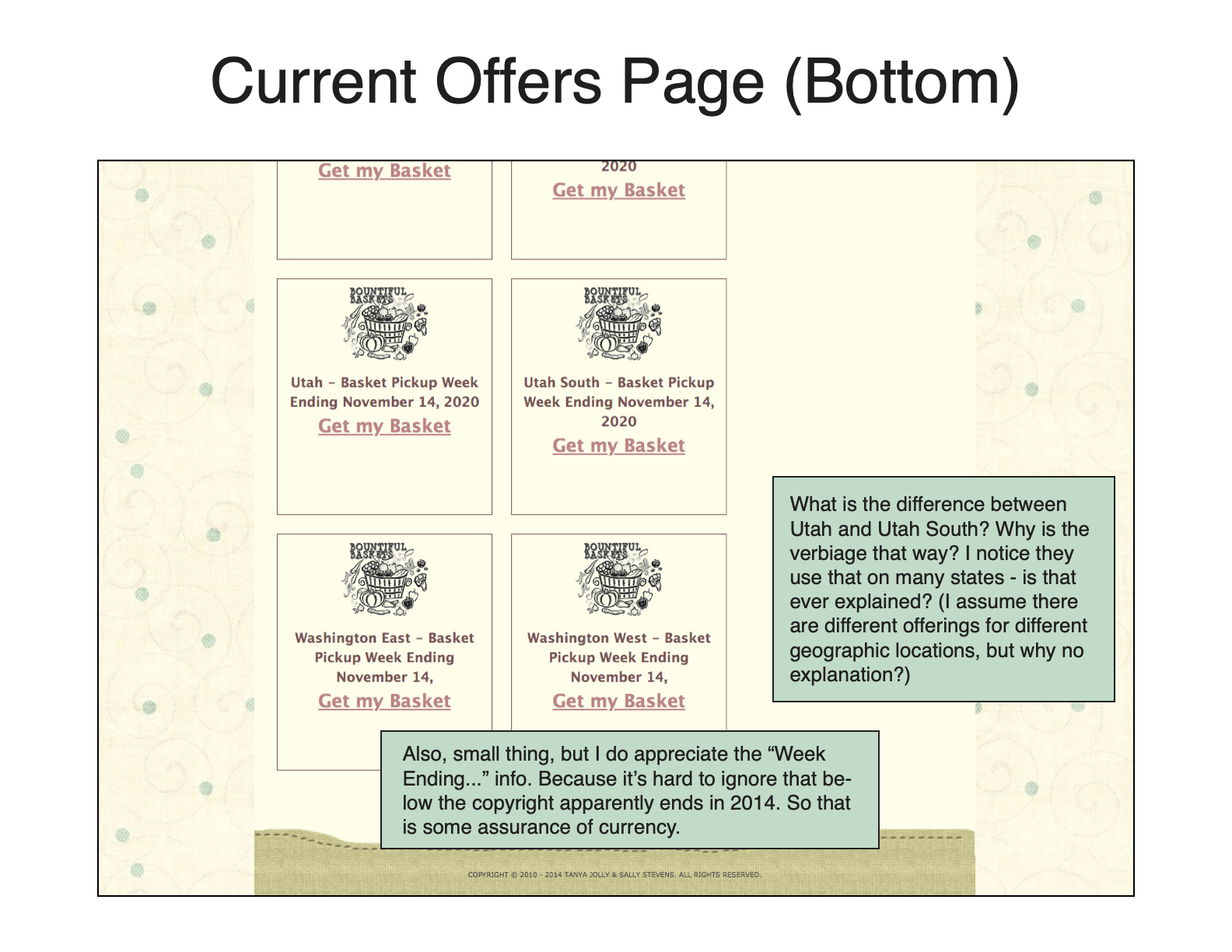
- In selecting a location, users need to have knowledge of which geographical region they land in their state. This caused confusion among all of the users who completed my usability test. Later in the process, you are prompted to select your county. I noted that it might be better to tailor the county selection to different geographical areas.
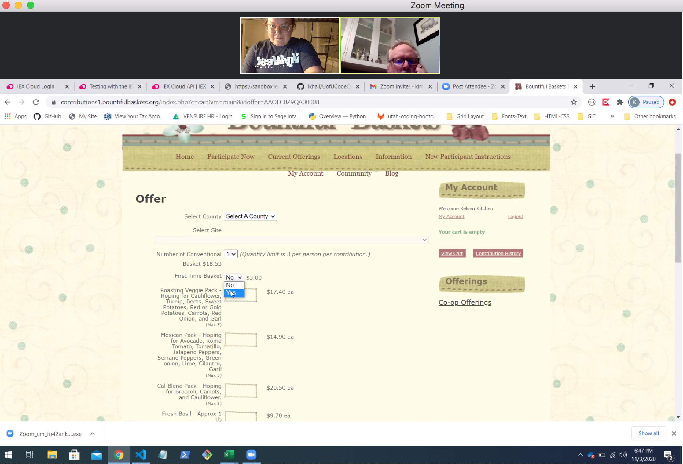
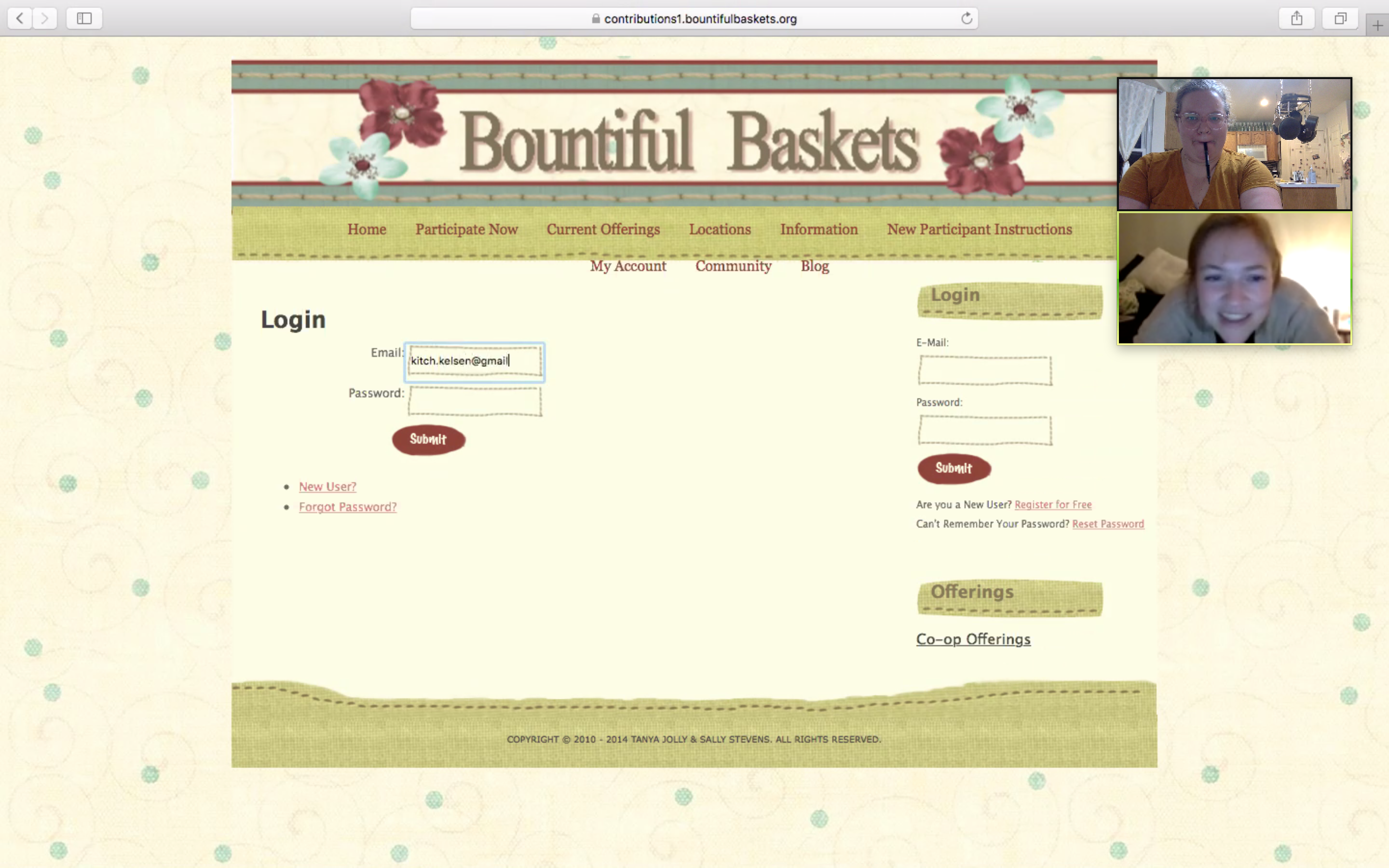
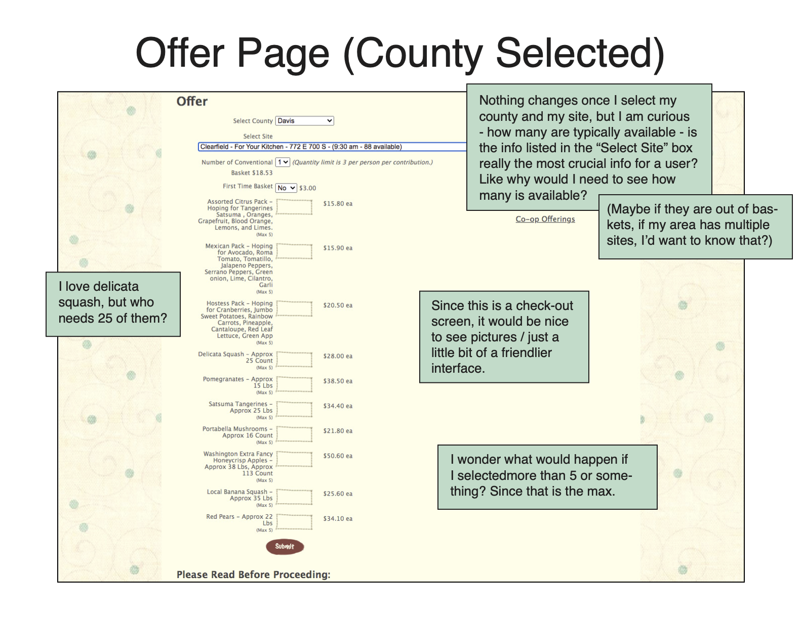
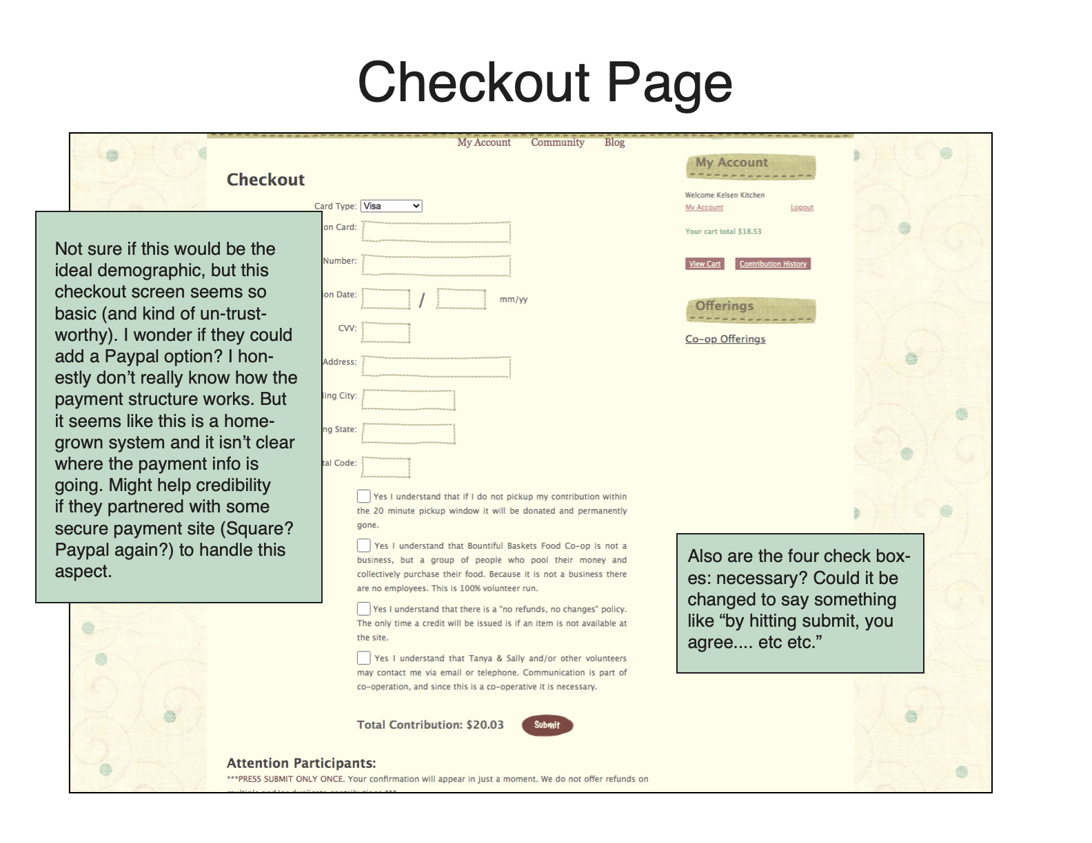
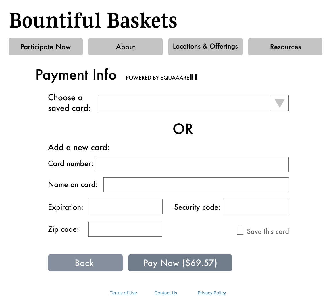
- The check-out page was very basic and, in a way, seemed untrustworthy. Additionally, the bottom footer for each page said “Copyright 2014.” Could Bountiful Baskets partner with Paypal/another 3rd-party vendor to create a more professional-looking checkout page?
Analysis
My initial research was two-pronged: I first sought the feedback of first-time users, and then recorded my own ideas and impressions as a Bountiful Baskets veteran. Performing the user research first helped me gain a new perspective on the site before I conducted my heuristic markup.
The primary problem I noted was that the site suffered from a cluttered and seemingly nonsensical information architecture structure. Users were simultaneously presented with too much information and yet unable to find the information they needed. There wasn’t a clear hierarchy of information; the information was prioritized in a confusing way. (Multiple users commented on the inclusion of an “Info” and “Instructions” page, wondering what the difference was between the two).
Throughout the site, there was “in group” language and knowledge assumed that affected the usability of the site. Early in the process, there was language used that first-time users had never had any exposure to (Conventional Basket, A Week/B Week, etc.). Additionally, the geographical locations of sites were split in a way that was never explicitly explained (again, assuming users had prior knowledge). For a seasoned user who has experience navigating the quirks of the site, this terminology becomes familiar or fades into the background; for new users, it was intimidating and confusing.
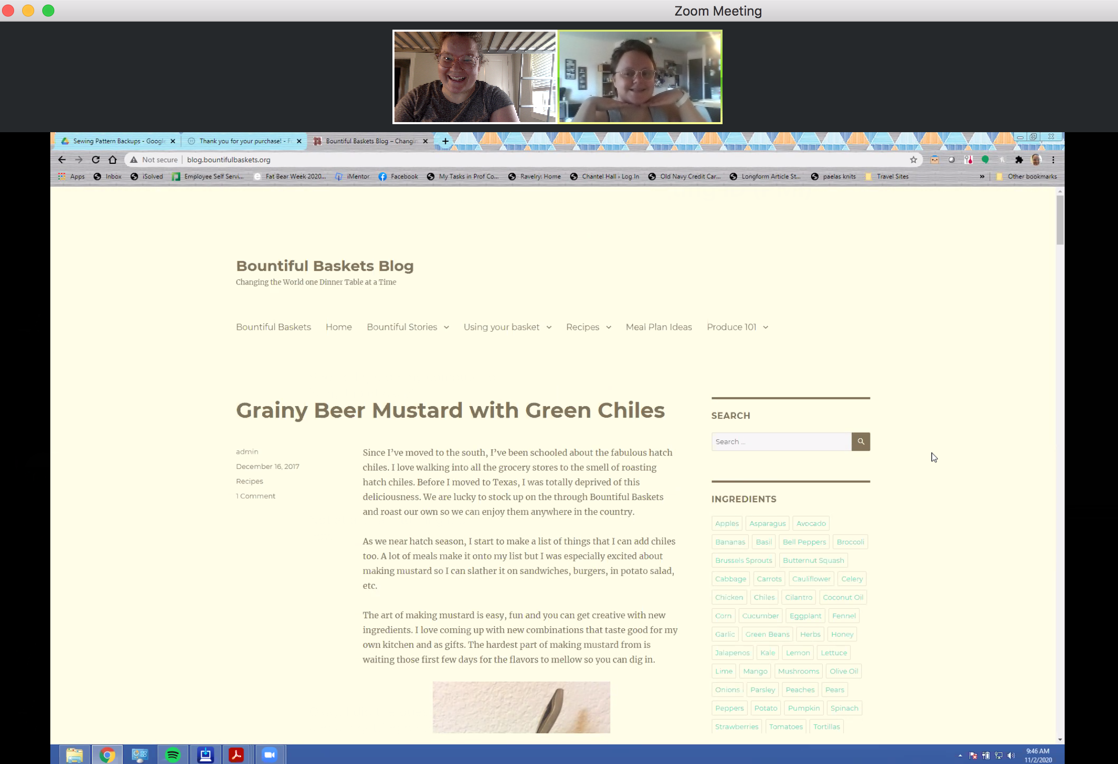
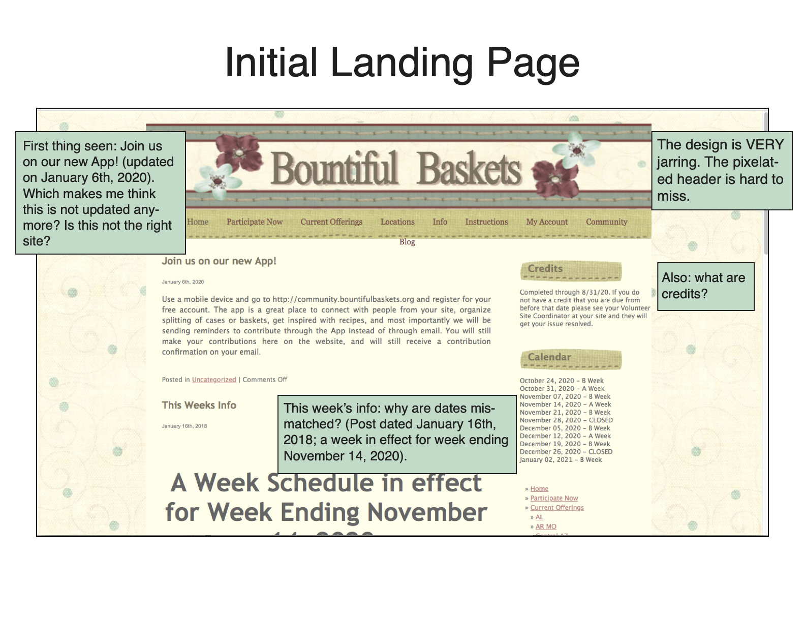
Finally, the visual design of the site left some things to be desired. The pixelated design elements, text color, overflow of the menu bar, and other elements contributed to give the site an air of untrustworthiness. Multiple users commented on the appearance of the site looking “outdated” and “old-fashioned.” In a real ding to its credibility, the Bountiful Baskets payment page is a very basic form; users who are used to more polished payment tools might hesitate to submit sensitive information through that form.
Design
Sitemaps
I created two sitemaps: one of the current site and one of my proposed reorganization.
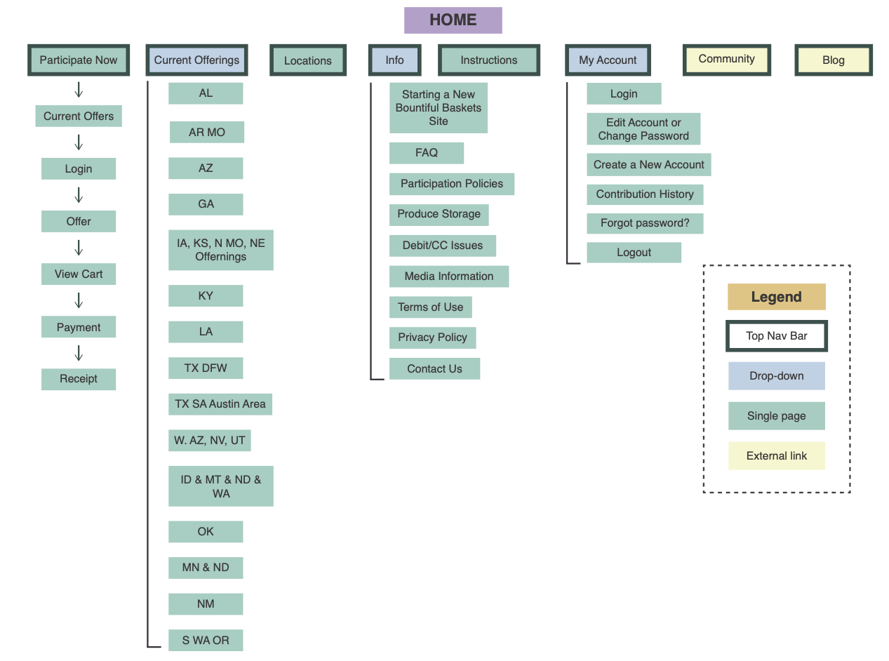
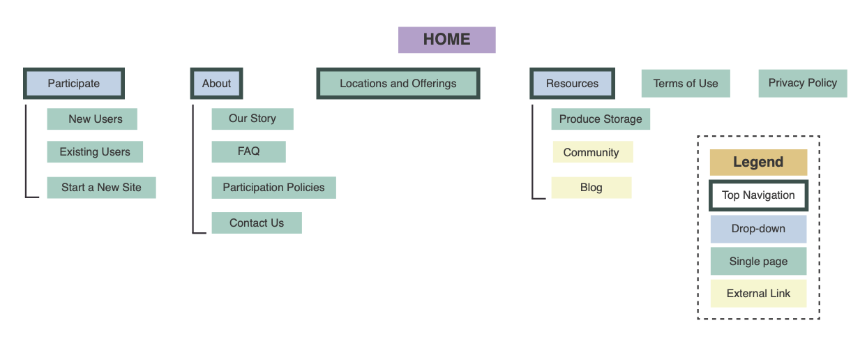
In my proposal, I tried to reduce and consolidate some of the redundant information. Some of the key changes in my new sitemap include:
- I bundled Locations and Offerings.
- I tucked the less crucial (or less used) links under Resources.
- I consolidated some of the information in extra pages to be on the FAQ page.
Tree Testing
Before I started to formulate my design brief of the proposed redesign, I wanted to test my site structure with users. After researching a few different testing methods, I decided to use basic tree testing of the site structure using Google Docs.
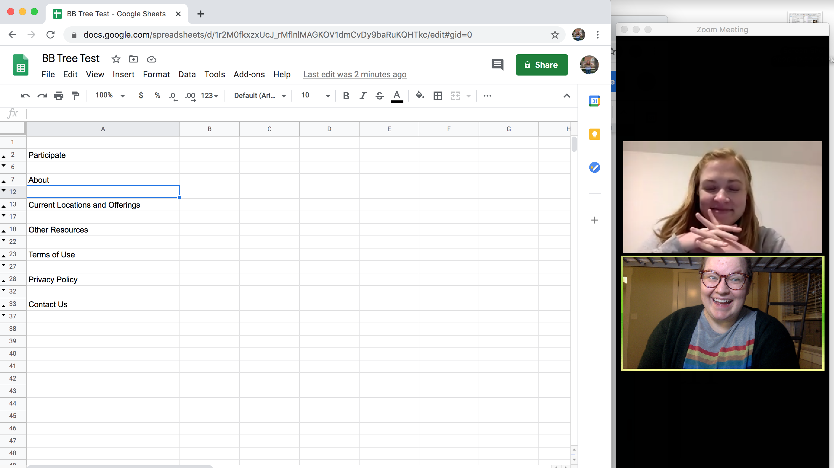
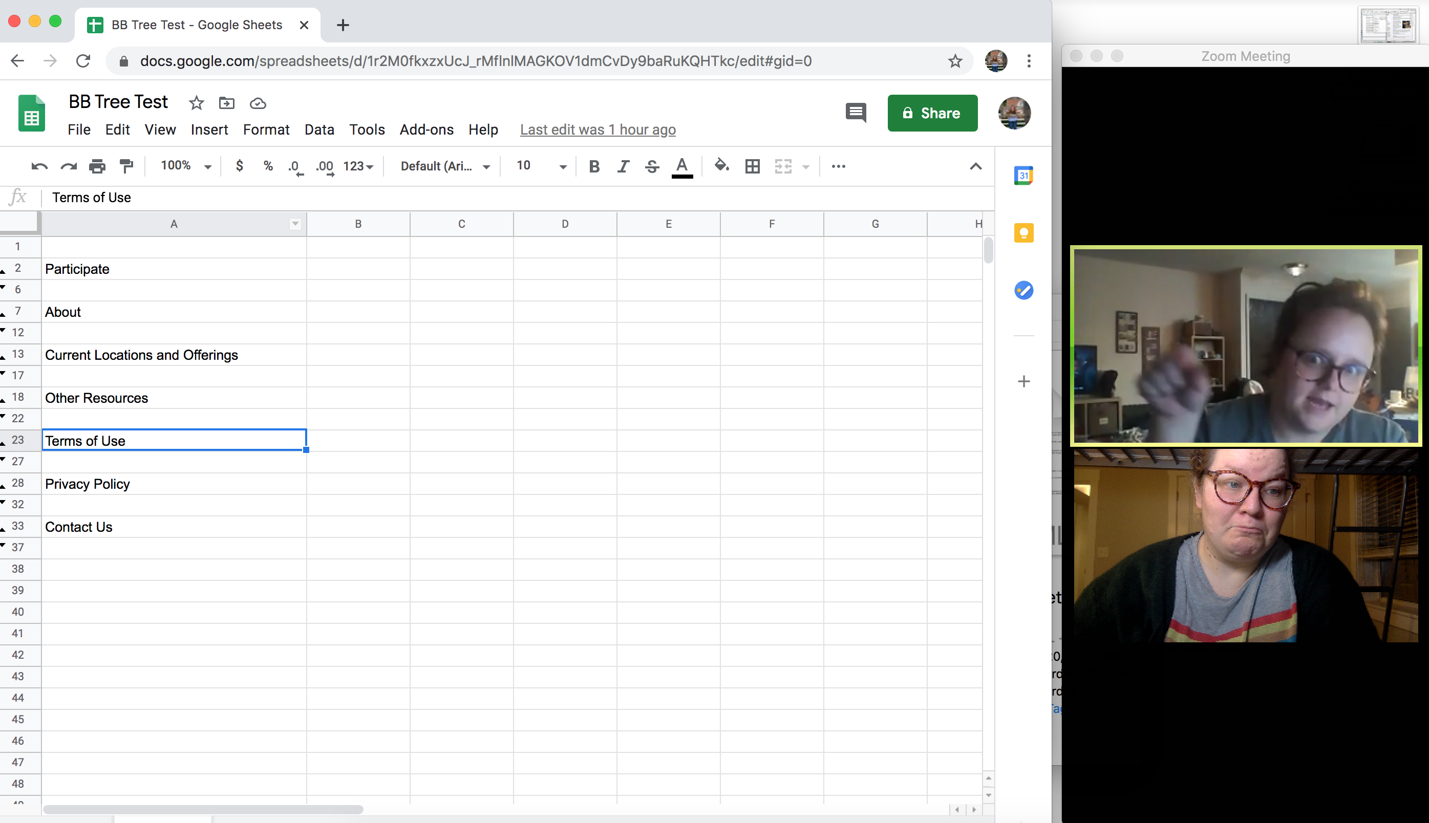
The tree test was extremely simple. I asked a couple of participants from the first usability test to complete variations on the tasks from that initial test. I was trying to ensure that my proposed information architecture made sense on a “first click.”
The tree tests helped me both feel like I was on the right track. After the test was complete, I also bounced a few ideas off of the participants regarding the new site structure, which was extremely helpful. I didn’t realize when I undertook this project how much I would miss working on a team and being able to collaborate with others. (This becomes a recurring theme.)
Design Brief
The design brief was another method I learned about from Leah Buley. The design aspect of this project was the most intimidating portion. As a trained technical communicator, I enjoy basic graphic design, but I am entirely self-taught in terms of design principles and tools.
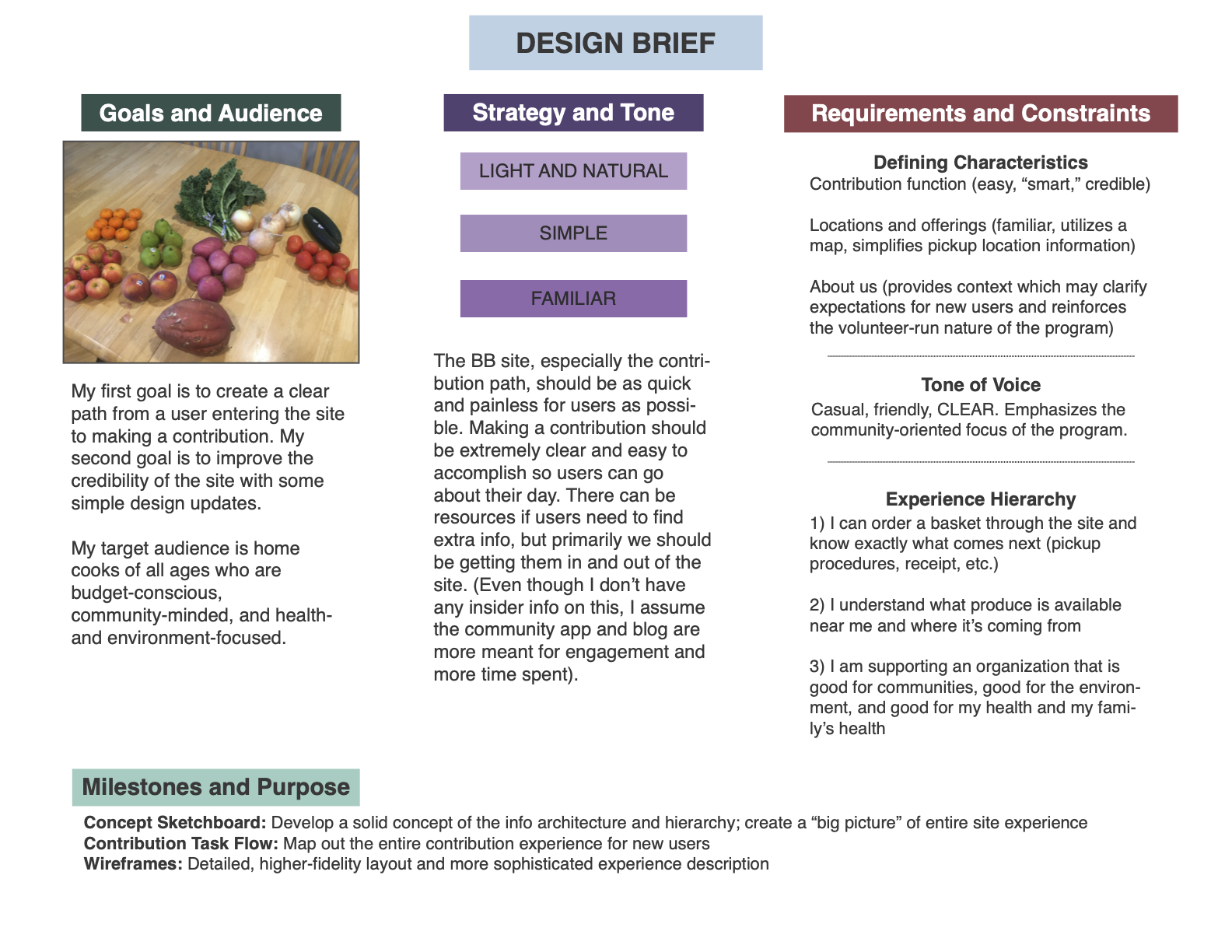
Following Buley’s method, I wanted to establish five items before creating the brief:
- Focus: My focus of this project was to improve clarity of the site: clarity of the information architecture, of the language used, and of the outcomes to tasks users completed. Through my user testing, I also realized that an important focus would be to improve the credibility of the site by making it look more current and professional.
- Audience: Although I don’t have access to any of Bountiful Basket’s data about their users (if they even track that), from my experiences and assumptions, I considered the audience home cooks of all ages (most likely between ages 18 and 65). Though the users would range in age and probably comfort with technology, I think some of the traits that they would have in common would be:
- Budget-conscious
- Community-minded
- Health- and environment-focused
- Features and functions: The most important function of the site is to facilitate user contributions. This in turn necessitates a clear and secure payment page. Another priority is a feature that shows users Bountiful Basket locations and the offerings at those locations.
- Feeling: My main concern for the feeling of this site is accessibility. I don’t want it to be intimidating or unclear in any way. The feeling I’d like to establish in the new site is simple, light, and familiar.
- Restrictions/expectations: In my proposed redesign, I am not going to eliminate any existing information (even if it’s unclear to me why the information is included on the original site). Though I will not be actually building a site, I am going to try to keep my design solutions matched to the capabilities of HTML5 and CSS.
Sketching and Sketchboard
The goal of this exercise was to formulate the “building blocks” of the site and develop a new basic interface that made sense. I also wanted to push myself creatively.
In my initial sketches, I focused on three important pages: the home screen, the New Users page, and the Existing Users page. I had a basic idea of a possible interface, but I wanted to sketch out a few concepts so I had options to choose from. I ended up with several sketches for each page, and the final concept I chose combined elements of most of the sketches.
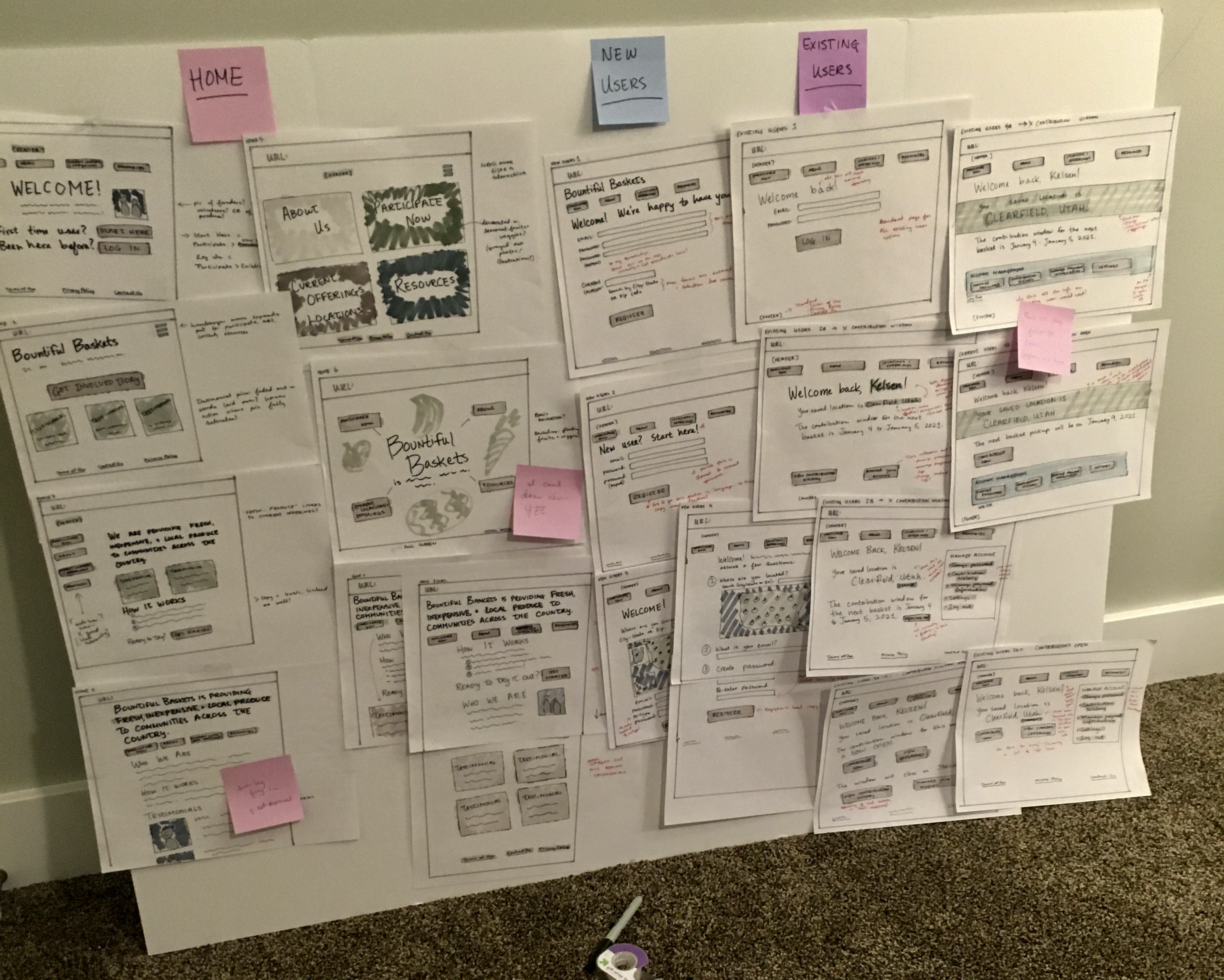
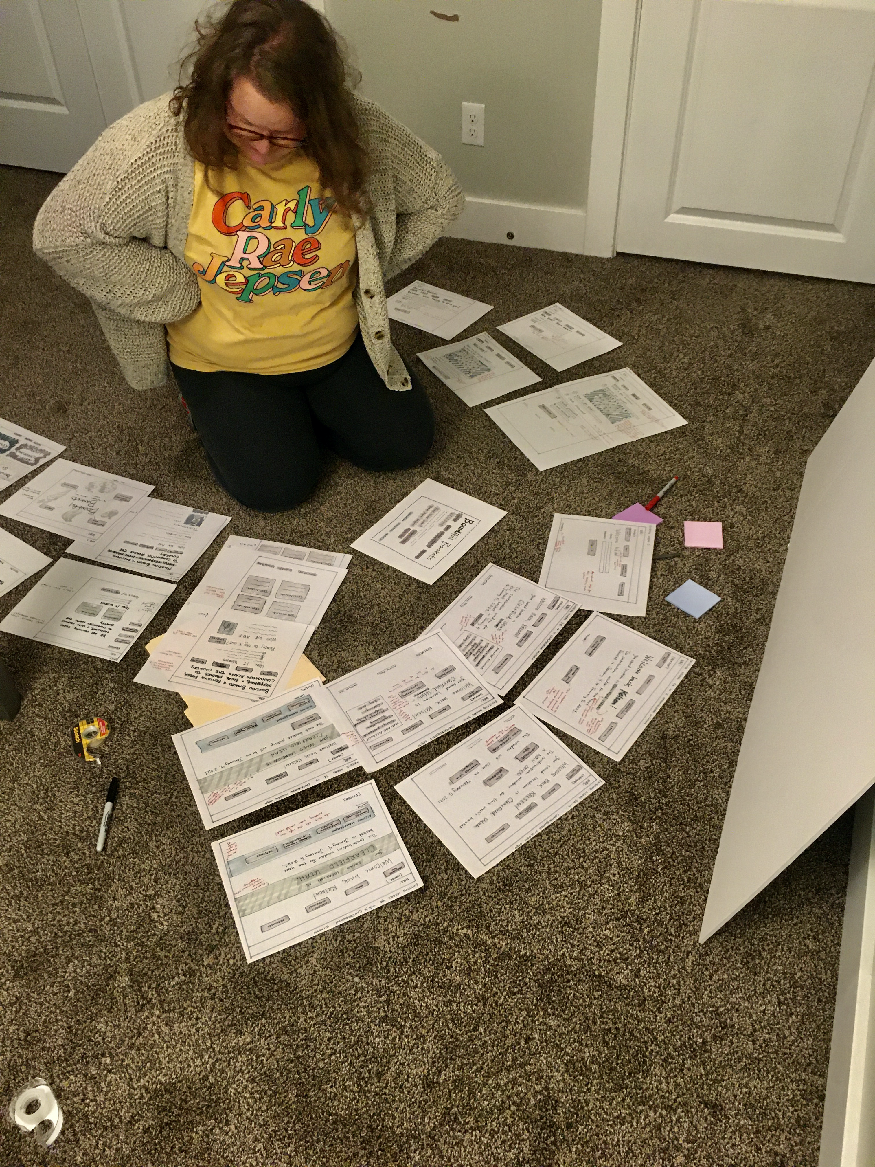
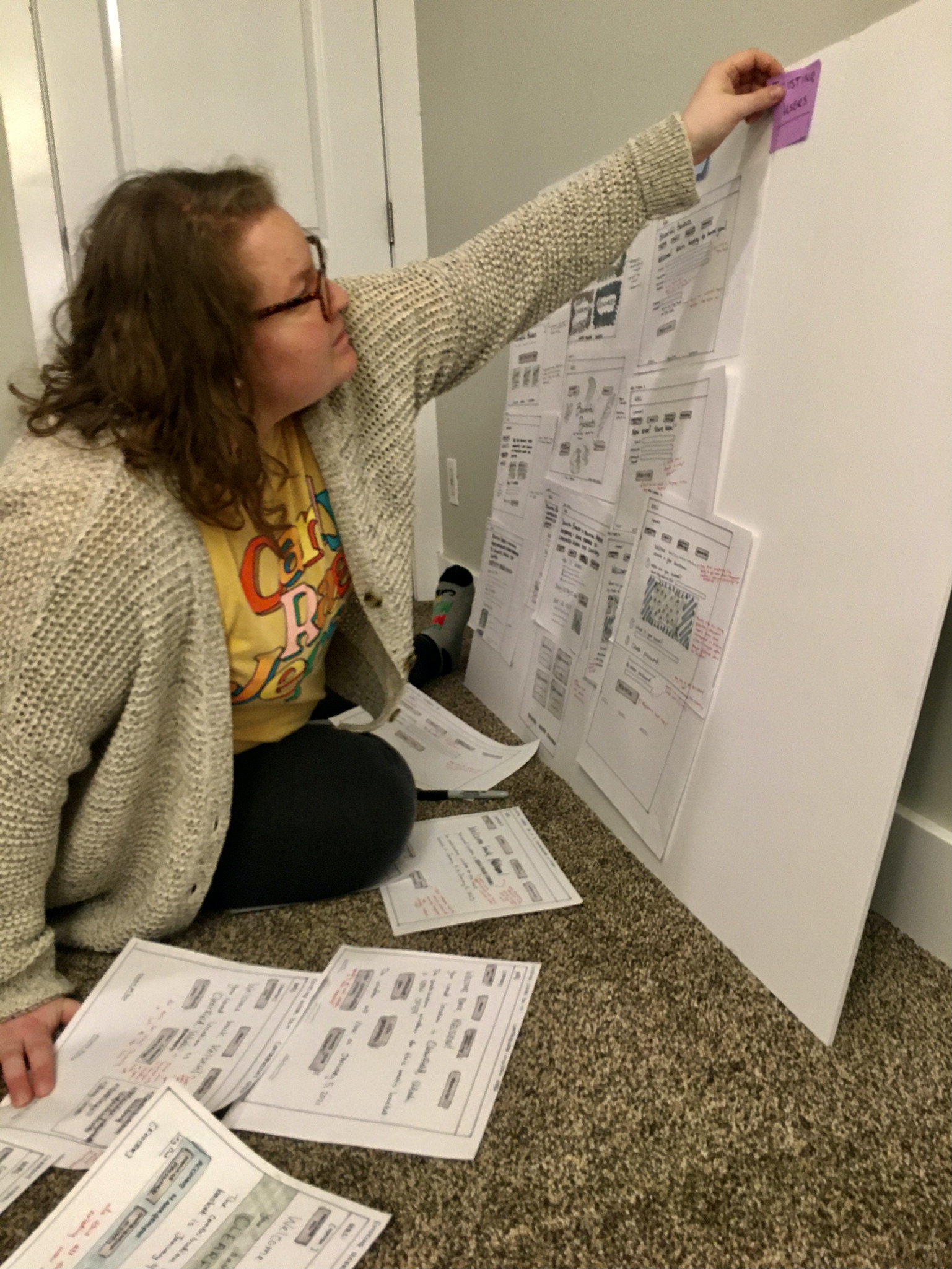
My method was to initially slam out as many sketches as possible (without getting too lost in the “planning” phase). When I had several sketches created, I decided to put together a small, basic sketchboard to get some idea of the cohesiveness of the interface.
The sketchboard served two purposes: it helped me organize the loose sketches I had floating around my desk, and it also gave me the opportunity to explain some of my ideas and reasoning to my friend Gayleen, who very generously came over to take pictures of the sketchboard assembly. Talking through some ideas with Gayleen helped me realize that a big aspect of this project that I had been missing was collaboration. I don’t mind working alone, but there is something irreplaceable about working on a team.
Task Flow
I theorized that the most crucial outcome of the website was gathering more contributions. I decided to do a task flow of the contribution process to get a better idea of what that might look like for end users (and get more sketching practice).
My task flow sketches were a little smaller than my site sketches (about half the size). I roughed out some ideas, decided on a final flow, and inked it in.
I added the task flow sketches to the sketchboard (which I expanded a bit from the first iteration with some butchers paper and a lot more post-it notes). I arranged the “final” sketches in context with the task flow.
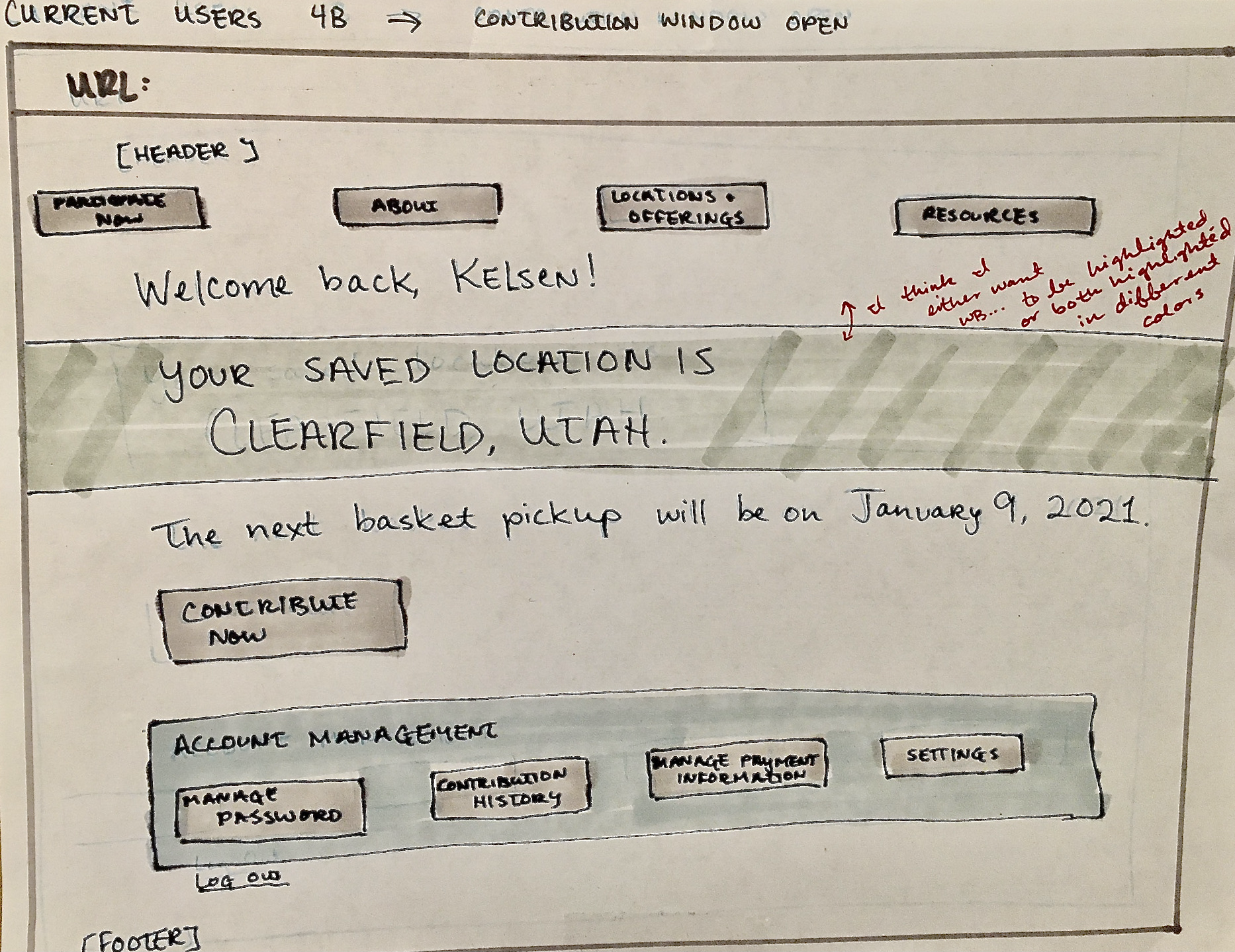
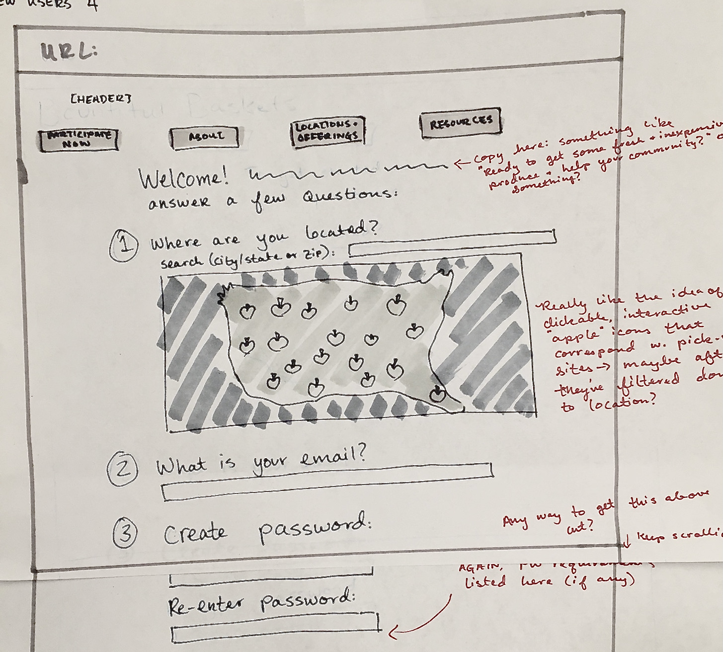
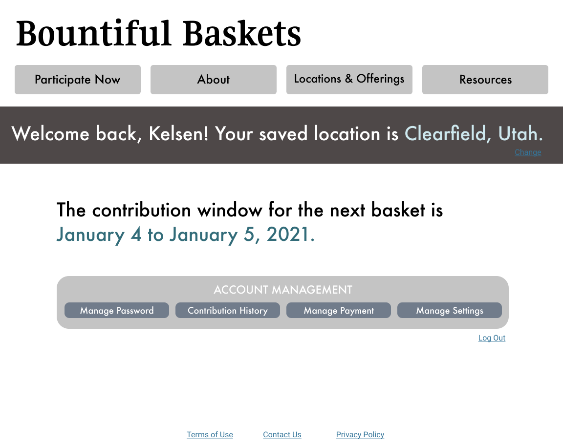
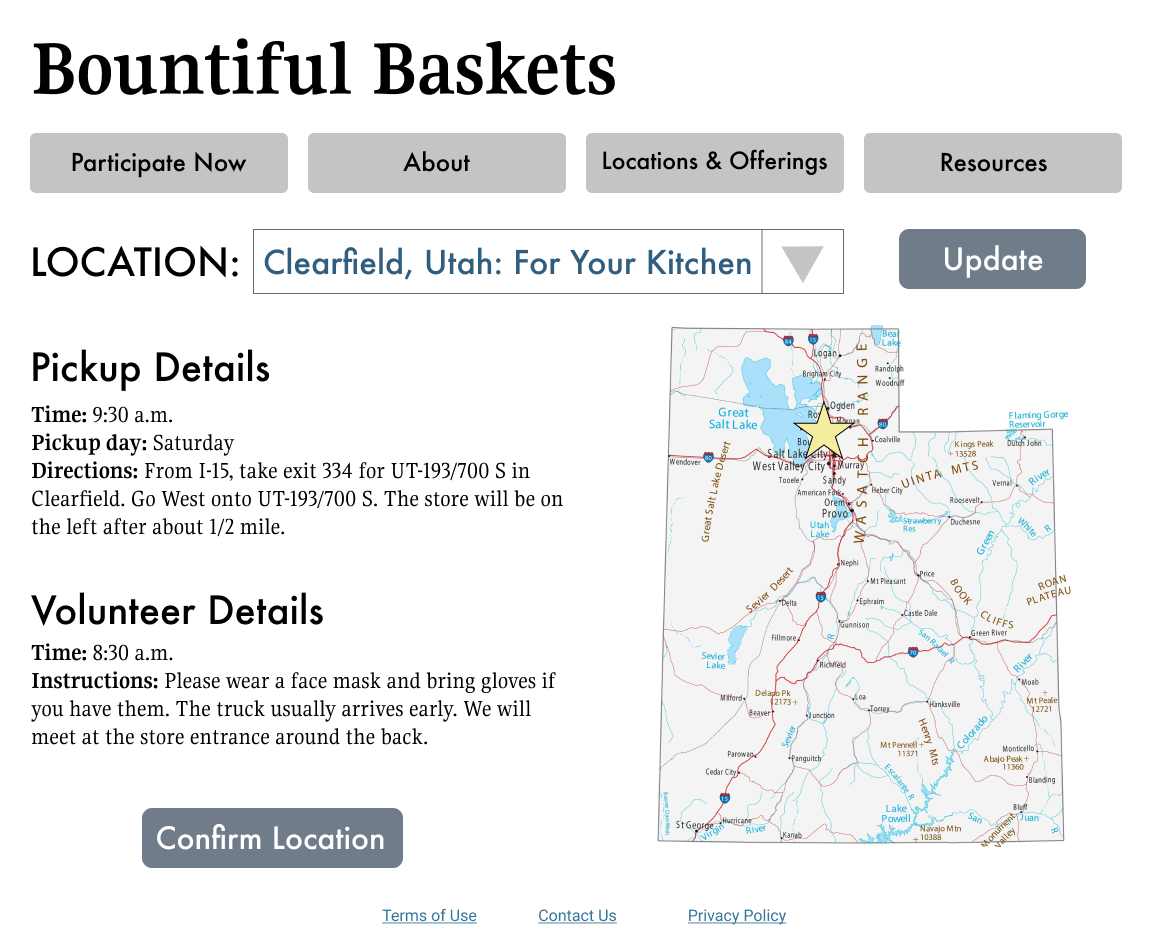
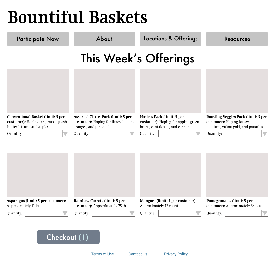
Wireframes
As the final deliverable for the project, I created some wireframes that were a little more higher-fidelity than the sketches but still very basic in terms of design. Rather than focusing on the visual design, I tried to focus my energy on the information architecture and the experience design (so I used shades of gray and the same two fonts throughout the wireframes).

I had never worked in Figma before, but I had heard about it from design friends. I completed a Lynda course on the basics of using Figma for UX design, which was very helpful.
Usability Recommendations
If I were to sum up my recommendations to make Bountiful Baskets site more usable in one word, that word would be "simplify." Through the user research, I learned that certain content expectations weren’t being met by the current site (where to find contact information, how to order a basket); not necessarily because these elements weren’t visible but because the elements were being drowned out by the visual noise of the site. In my proposed site map, I tried to consolidate pages that were similar, eliminate redundancies, and tuck pages that seemed less-trafficked into a tab together.
For copywriting, I would recommend that Bountiful Baskets introduces their concept early to create user buy-in. For users who were completely unfamiliar with Bountiful Baskets, they immediately looked for an “About Us” paragraph. If Bountiful Baskets included an “elevator pitch” line on their home page, even if it was just one sentence, it would clarify the purpose of the site. Additionally, I’d recommend using community-centered language to appeal to target users and draw focus to the fact that the organization is run completely by community volunteers.
In the current contribution task flow, users were thrown off by the form layout. It wasn’t immediately clear what their contributions were buying. I’d recommend updating the offerings pages to include photos and developing a feature that allows users to save their location and payment information. Of all the steps in the contribution task flow, the payment page needs the most attention. The current design, a very basic form, hurts the credibility of the site and might make new users reluctant to enter sensitive information. This could maybe be rectified by partnering with a well-known payment system (PayPal or Square); at the very least, it would be beneficial to improve the design of the payment page by focusing on spacing elements appropriately and using contrast to delineate different information boxes.
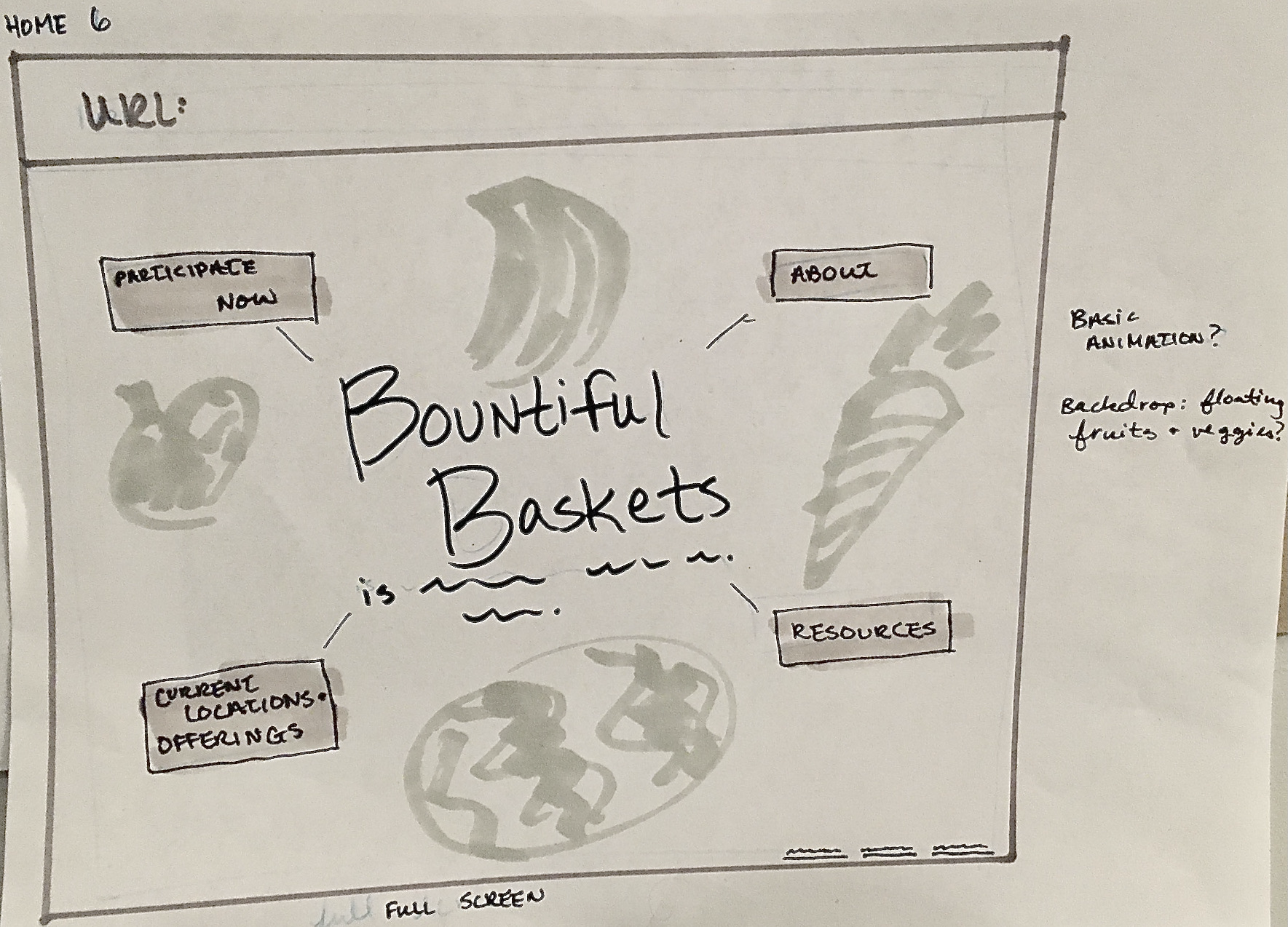
Finally, I would recommend a simplified design. Some basic updates that might improve the site design include:
- Replace the pixelated header with a non-pixelated header OR even a drastically simplified header (Bountiful Baskets in serif font, for example).
- Reduce the number and increase the size of the navigation buttons to eliminate the navigation overflow.
- Update the color scheme to something simple and cohesive. One possibility would be four different hues evoking the four seasons.
Final Thoughts
When I first decided I wanted to do this project, I didn’t quite understand the scope of a full site re-design. It was a humbling experience! There were a LOT of decisions to make, big and small, even in this very informal project. One important realization I had while working on this is that I very much rely on bouncing ideas off of others. A project of this scope needs a team.
That being said, this project was a lot of fun for me. The research was very rag-tag, but I still feel like I gained valuable insights and connected with other people. I had the opportunity to learn a brand-new program (Figma) that I am excited to use more in my professional life. I feel like this project helped me gain more empathy; both for site users and for the creators of the Bountiful Baskets site (who were almost certainly volunteers developing the site in their free time). If I decide to undertake another proposed redesign, I think I will focus on a specific process in a website or an app, rather than a full site.